
We have redesigned and improved the user experience for the healthy food delivery service – Fresheo.
In the guide case, we describe in detail how we conducted the discovery phase and developed a website redesign strategy.
Ordering Flow Improved for Mobile Food Customers
Our client is a Belgian startup, called Fresheo, which specializes in healthy food delivery. Their goal is to deliver healthy food to as many people as possible and save them time on cooking that could be put to better use enjoying their favorite activities.
Client Request
Fresheo had a top business objective of expanding into new regions. In addition to this, the service conversions did not meet their expectations. They knew that they could increase the number of users by adding some new functionality and updating the external design of the interface. Fresheo was looking for out-of-the-box thinking and insights from us without violating the main concept of their product. They turned to us for help in making this vision a reality.
Discovery
We started things off by holding several meetings with the client and the UX / UI team to gain a deeper understanding of our client’s problem and fill the knowledge gap regarding their market, customers, and broader product strategy.
Research and Competitor Analysis
We performed an analysis of the current website for healthy food delivery. The analysis consisted of several stages:
- Conducting an interview with the client to clarify all the important questions
- Examining the structure of the website
- Conducting a usability audit of the site, making a list of competitors, and analyzing their strengths
- Identifying the main problems of Fresheo’s service
- Generating ideas and ways of solving problems that will work for the case we had to solve
Ideas and Suggestions
After an in-depth analysis of the service, we determined that the user visits less than 2 pages per session on average, and the share of returning users is only 12.4%. Needless to say, this isn’t very good. One of the main goals of the redesign would be to increase the session duration. The analytics show that the demographic breakdown of the main audience of users is 66% women of just about any age.
We decided that the main emphasis should be on the graphical component of UI design, in order to increase the visual appeal of the site. Also, due to the fact that 70% of traffic comes from smartphones, we first needed to think about adapting the site for mobile devices. Therefore, our main plan was to improve the UX / Ui on mobile devices and simplify the flow of the ordering process. Each page should engage the user in the online ordering process, instead of calling in their orders, which would significantly reduce the work volume of the call center.
We paid special attention to such important pages as:
- The landing page
- The order flow
- Various menu pages
- The user profile
- Loyalty program: sponsorship and bonus points – this is a new functionality.
- The User Dashboard, which was also a completely new functionality.

Workshop with ideas
Project Estimate
After working through our ideas, we determined the broader strategy for the revision and carried out an assessment of the working time that would be necessary to create a new website design.

Table with product requirements with an assessment
Our Solutions
We would go through the key pages of the site and, once again, see how fixing seemingly small interface errors affects the quality of user interaction with the interface, and hence the key indicators of the site.
Landing Page Evolution: Involving Entry Points and Structuring With the Proper Hierarchy
Since we were not tasked with completely changing the structure of the landing page and redoing the UX aspect, we focused on visual solutions and thought out the UI concept i.e. a logical sequence of information blocks, general style, color scheme, graphic patterns, fonts, and selected a suitable grid. We started working on the most critical bugs first, which included:
- An unusual arrangement of elements on the page.
- The lack of a clear entrance to your personal account via the main navigation of the site. There was no way to quickly view notifications either. Not all menu items were immediately clear to the user.
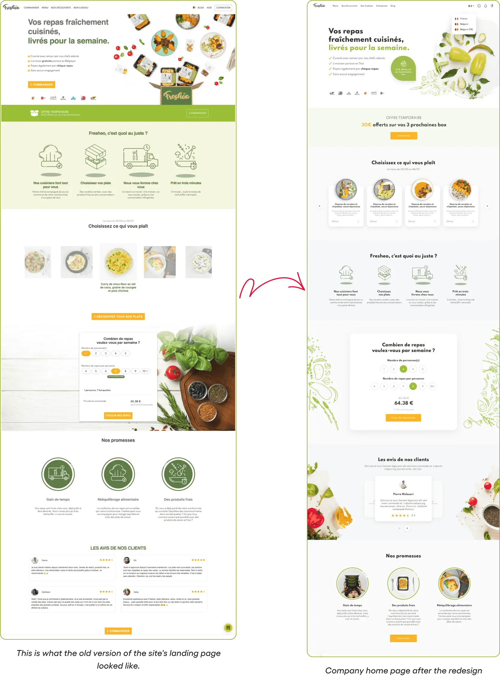
When choosing a new design, we proceeded from the reaction of the potential target audience. However, in order to find the best rendering solution, we also had to make sure that existing users can quickly get used to the changes as well. Our main changes were as follows: redesigned the structure of the home page and strengthened entry points. We also made it possible for Fresheo to communicate with users in the main banner: from the first seconds of interaction, inform them about various beneficial offers in order to motivate them to go further.
The navigation was designed in the form of a horizontal menu on desktops and in the form of an adapted burger.


We engage the user with entry points that have bright, emotional photos and show menus with dishes with a “face” so that people can see real information.

We paid especially close attention to the call to order section, but more on that later.
On the part of the client, there was maximum involvement, active participation in decision-making, and agreement on the concept.
Order Flow: Prioritization of Filters and Efficient Use of Space
The main problem with the ordering process was that users did not always understand how to place an order and often contacted the call center.

To create a good user experience, we have modeled the flow in the form of a step-by-step funnel, thus helping the user move on to complete the order. Key errors were fixed and we created a simple and understandable user order path, divided it into semantic blocks, and implemented it in 3 steps:
- The choice of diet for the total number of people
- Menu for the week
- Checkout

The final stage of the user journey is Checkout, where it is important to make the process as simple and convenient as possible so that nothing prevents the user from completing the order. Therefore, we removed all possible exit points from the header. Our goal, as UX experts, was to increase the percentage of successful orders as much as possible.

After the order has been placed, we display a thank you page to the user and focus on the “Home” button so that the user continues to explore the site, and does not leave immediately after completing the order.
The Menu Section
We made changes to the Menu section to divide the menu of the week into categories and ingredients. We also made it easy to filter dishes by ingredients.

The User Profile
We have radically changed the user profile, simplifying the navigation. The interface architecture was now properly organized. We made it possible to add your own payment and delivery methods and manage them through the profile.

Loyalty Program
In the old version of the site, the loyalty system was implemented in a rather strange way and each user simply had a constant discount.

We included the ability to gift an order coupon to another user.
In the new version of the site, we proposed to implement a loyalty program in the form of bonus points for the following actions:
- My first order.
- Continuous subscription.
- Invite a friend.
Customers will be able to receive gifts and badges when they have accumulated a certain number of loyalty points. However, while these proposals were still in development, we implemented a page with gift coupons. With a mobile-first approach, users can easily track their orders and rewards.
User Dashboard
Our concept for the new Dashboard came from the drawbacks of the old design of the service where all important information was scattered across different pages. This is why we decided to put everything on one page and presented the information as compactly as possible using a convenient dashboard.

Now, the user will have all important information conveniently in front of them.
Conclusion
In the new design for Fresheo, we have implemented many proven solutions:
- We included as many entry points to other sections of the site as possible on the main page
- We structured the information, as a whole, on the site.
- Fixed the correct operation of filtering and sorting tools.
- We packed all the important information into a dashboard.
For better interaction with the team and the client, we partially implemented the interactive prototype of Figma.
We always start the development of interface design with wireframes, which is an important step in any design process. This allows us to define the information hierarchy of your design, making it easier to plan your layout according to how you want the user to process the information. Throughout the entire project cycle, we wrote design documentation and recorded a video explaining the behavior of the stream, as well as digests about the work done.
The main insight of Fresheo’s leading UX designer after reviewing the work done:
Changing the order flow and simplifying the profile section may seem like a small thing, but we often forget that the user experience never ends. Going back and improving our previous solutions is just as important as redoing something from scratch.